WHALEBACK
Rebranding a planning consultancy that champions better ways of living
-
Whaleback is a planning consultancy working across the South of England.
In despite of their track record of award-winning projects, Whaleback were still operating with a DIY brand identity and website.
I was approached as they felt their way of communicating no longer matched the quality and sophistication of their purpose, work and team.
Inspired by the poem Sussex by Rudyard Kipling, the name and their existing logo - a wood engraving by artist Jonathan Gibbs - represents their close relationship with the local area and its heritage. Part of the brief was to retain that connection and to bring in their multi-faceted experience and appreciation of tradition, history and contemporaneity.
I was commissioned to create a new brand identity, website and branded materials such as report templates, email signatures, and social media templates.
-
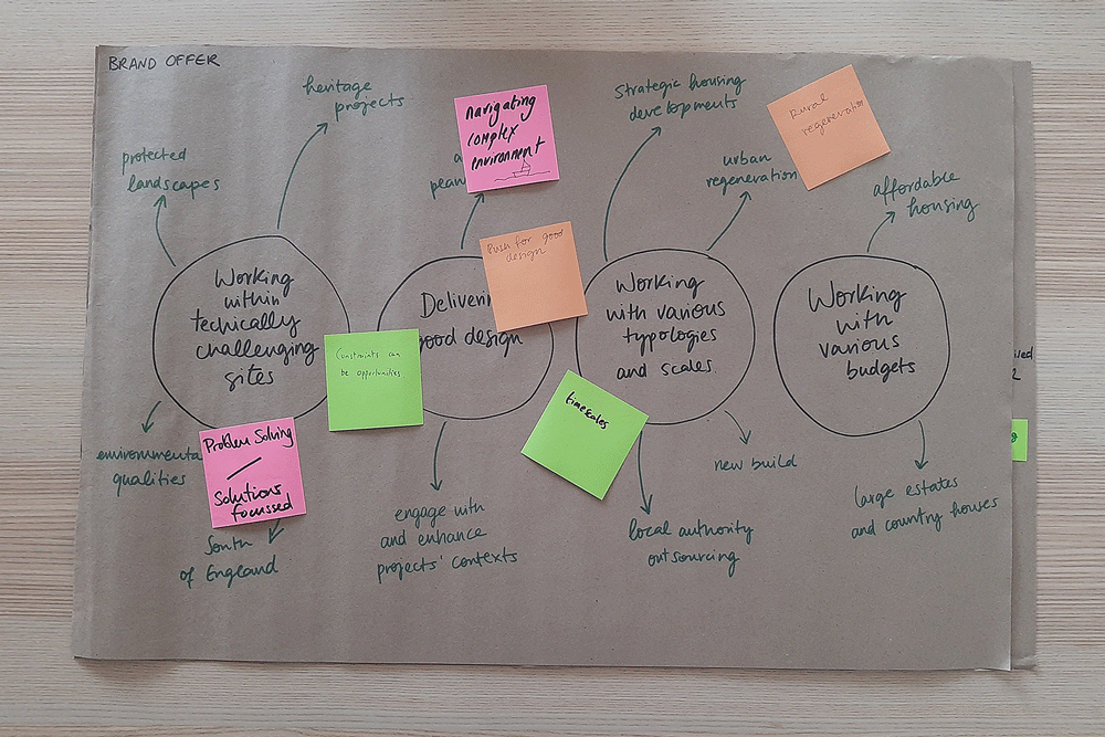
Our strategy sessions led us to the conclusion that we needed to better represent Whaleback’s attitude to planning.
The new brand identity had to encompass the layers of meaning and care that are put into the practice’s work as well as the diversity of their projects.
Whereas architects traditionally tend to revolve around the built object, Whaleback’s role as planning consultants focuses on what surrounds the built object; on the spaces in between.
Inspired by these conversations and taking cues from the Nolli map by Giambattista Nolli, we used the idea of negative space as the visual prompt for the brand identity.
To give continuity to the existing brand and to retain its crafted quality, we worked alongside Jonathan Gibbs to create a series of shapes and textures that we could use as part of the brand identity.
The logo can be interpreted as an abstract representation of a whale or of an outline of the South Downs landscape. The textures can be mixed and matched, capturing the practice’s diversity and dynamism.
To reference the cultural heritage of South Downs that welcomed personalities such as Edward Johnston (London Underground’s typeface designer) and Eric Gill (Gill Sans typeface designer), the logo uses P22 Underground by P22 Foundry, a modernisation of the 1913’s Johnston’s typeface for the London Underground.
This is paired with the use of Crimson by Sebastian Kosch, capturing the practice’s attention to detail and craftsmanship.
The colour palette is minimal, letting the richness of the textures come to the fore. Black, white and beige are complemented with a sparing use of red.
Given the length of projects in planning and architecture, we created a device that allows Whaleback to visually represent projects at their early stages, when photography isn’t likely to be available. Once again referencing the Nolli map, the textures are used as backgrounds to site plans emphasising what happens in the spaces in between.
SERVICES
Brand Identity, Web Design
CLIENT
Whaleback
TEAM
Artist – Jonathan Gibbs
Branding and Web Design – Ana Bea Studio


“With calm confidence, Ana Bea revealed a brand identity that felt inevitable, as if it had merely been waiting to be uncovered.”
– RICHARD DOLLAMORE, DIRECTOR, WHALEBACK


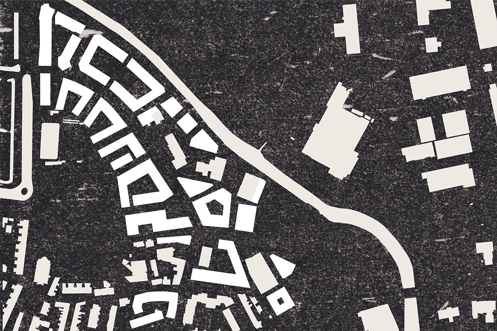
Branded site plans using Jonathan Gibb’s prints

Original prints by Jonathan Gibbs used as part of the brand identity

