DG CITIES
Brand refresh for a consultancy at the forefront of urban innovation
-
DG Cities describes itself as an unusual company – a small but mighty team working across policy, technology, and research, collaborating with both local communities and government departments.
With its 10-year anniversary approaching, they saw an opportunity to refresh their brand and bring it up to date.
The main goal was to bring clarity and consistency to its communications while unifying its four areas of expertise into a cohesive visual identity.
DG Cities asked me to refine their existing logo and to develop a refreshed colour palette, typography system, graphic elements, guidelines for photography and illustration, and easy-to-use templates for presentations and reports.
-
Our initial conversations about the brand led us to conclude that a brand refresh was more suitable than a complete rebrand.
During a collaborative workshop exploring current and future perceptions of the brand, we realised that the refreshed identity needed to be simple, practical and easy to use.
With this in mind, we kept elements of the existing logo but introduced a new approach to colour, typography, graphic elements, photography and illustration.
The updated logo retains the key features of the original but adopts a more cohesive visual language, making it feel less fragmented and more consistent.
To keep things simple, the brand uses a single typeface in two different weights. The new typeface, Poppins, is a geometric sans serif that offers greater clarity and a more open, legible feel compared to the previous choice.
The colour palette is fresh, minimal and easy to work with. A core palette of off-white, black and green is complemented by a highlight colour. Each of DG Cities’ four main areas has its own highlight colour, helping to distinguish them while maintaining a consistent overall look.
The graphic elements add warmth and playfulness to the brand. Grid and dot patterns reference data and infographics, while the framing device for imagery introduces the concept of layering and offering new perspectives.
Photography plays a key role in DG Cities’ identity. We established four guiding principles to ensure all images feel authentic and engaging: photos should prioritise people, feel relatable, highlight benefits and present a holistic view of their work.
Illustrations add another layer to the brand, helping to communicate complex ideas in a clear and accessible way.
SERVICES
Brand Identity
CLIENT
DG Cities
TEAM
Branding – Ana Bea Studio


“Ana Bea was able to bring clarity, a little more fun and a lot more impact to the brand identity”
– SARAH SIMPKIN, HEAD OF COMMUNICATIONS, DG CITIES
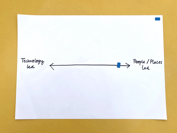
Present and Future exercise

Keep, Stop, Start exercise

Team workshop to identify current perception challenges and future needs

